Crafty Logo Animation
The goal of this project was to create a playful logo animation for the Crafty brand. I wanted the motion to feel handmade, creative, and intentional from the first frame. Rather than simply revealing the logo, I designed the animation so that the individual elements build toward the completed identity, making the motion feel like part of the brand itself.
PLANNING & INSPIRATION
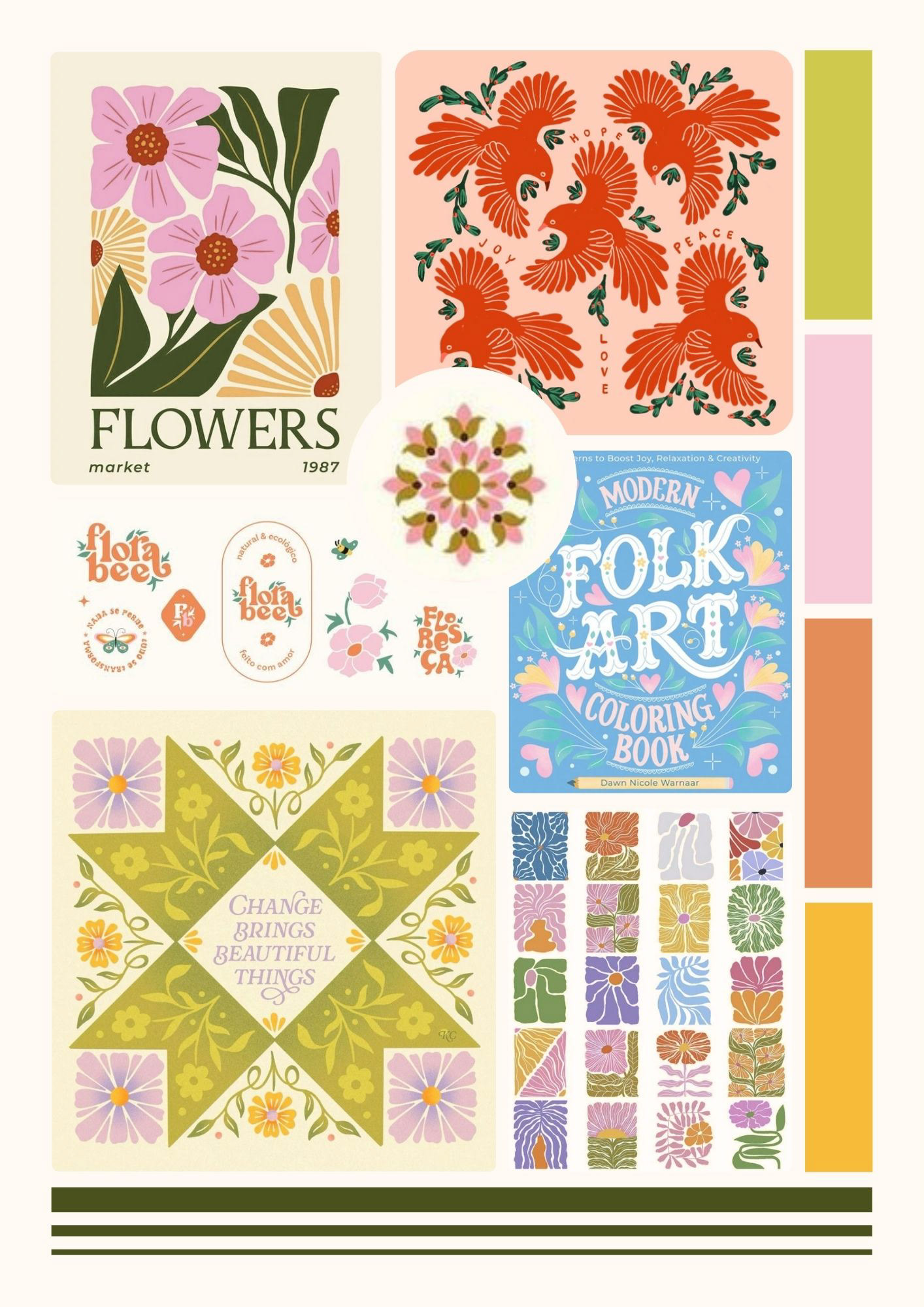
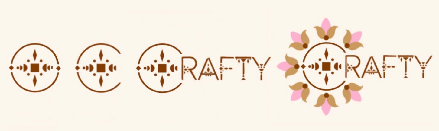
I began by exploring different logo concepts through sketches and visual research. I focused on circular forms, floral elements, decorative typography, and soft pastel colors to create a warm and approachable visual identity.
My inspiration centered on handmade and craft-inspired aesthetics. I wanted the final design to feel playful and decorative without becoming overly complicated. The circular structure became the strongest direction because it provided a clear foundation for both the logo and its eventual animation.
VISUAL DEVELOPMENT
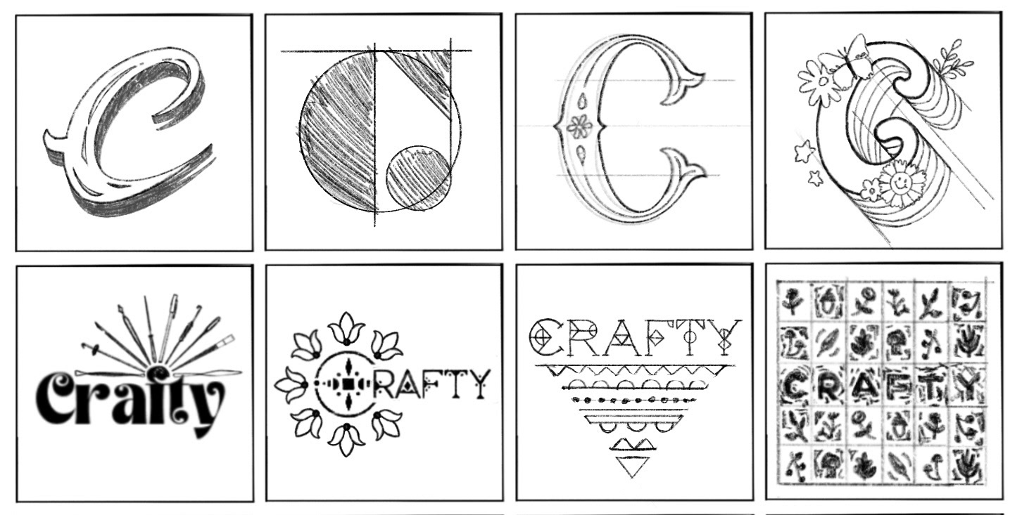
I developed several logo ideas through initial sketches before refining the chosen direction. I explored the relationship between the circular mark, typography, and decorative elements and gradually simplified the design into a cohesive final style.
The final visual direction uses a soft pastel palette and floral details to reinforce the handmade personality of the brand. The style frames helped establish how these elements would work together before animation began.
ANIMATION PLANNING
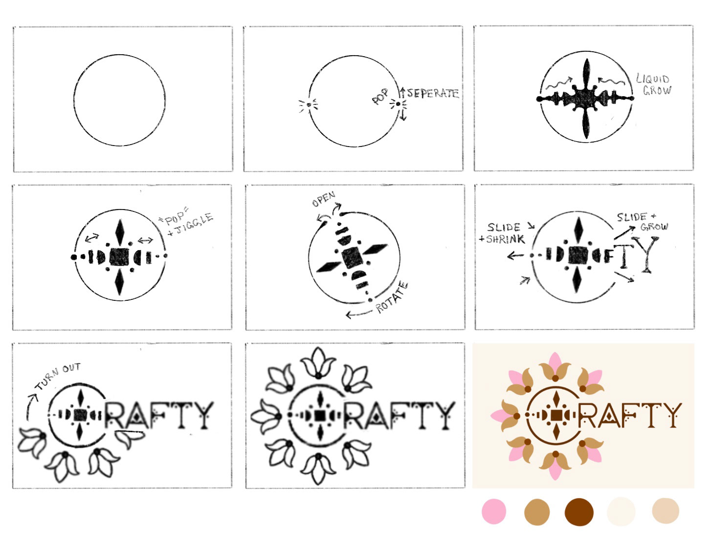
I planned the animation by breaking the logo into individual movements. The storyboard established a progression from the initial circle through the rotating and expanding shapes, the appearance of the CRAFTY lettering, and the final floral reveal.
I planned movements such as popping, rotating, sliding, shrinking, growing, and turning so that the elements would feel connected instead of appearing independently. This helped establish the timing and overall rhythm before production.
PRODUCTION
I created the animation in Adobe After Effects, animating the logo elements individually so I could control their timing and movement.
The animation uses principles from the 12 Principles of Animation, including timing and spacing, anticipation, squash and stretch, arcs, follow-through, and overlapping action. These principles helped give the movements more personality and kept the logo from feeling rigid or mechanical. The animation was built around the idea of the logo coming together piece by piece, with each movement contributing to the final reveal.
POST-PRODUCTION & REFINEMENT
I created an initial version of the animation to test the overall sequence and movement. After reviewing the first version, I refined the timing, transitions, and relationship between the individual elements. Comparing the earlier version with the final version helped me identify areas where the motion could feel more cohesive and intentional. The revisions strengthened the overall reveal and gave the floral elements a more expressive role in the ending.
FINAL ANIMAITON
The completed animation brings the individual logo elements together into a cohesive reveal. The final movement reinforces Crafty's playful, creative, and handmade identity while demonstrating how motion can extend a static logo into a more engaging brand experience.